Wayfinder RCM
Brand Identity
When Wayfinder came to Averson we immediately clicked. We love this team. President and co-founder, Amy, reached out indicating that their medical billing company was renaming and rebranding and looking for a partner to help their "outsides match their insides."
Wayfinder Revenue Cycle Management bucks all trends in their industry. By their own volition, they are courageous communicators, bold collaborators, and ongoing innovators. A process and approach that humanizes something as typically sterile as medical billing required an avant-garde brand. The result was a cohesive, synchronized rollout that highlights the best of their trailblazing mentality.
Collaborators: Averson Creative


Behind the Logo
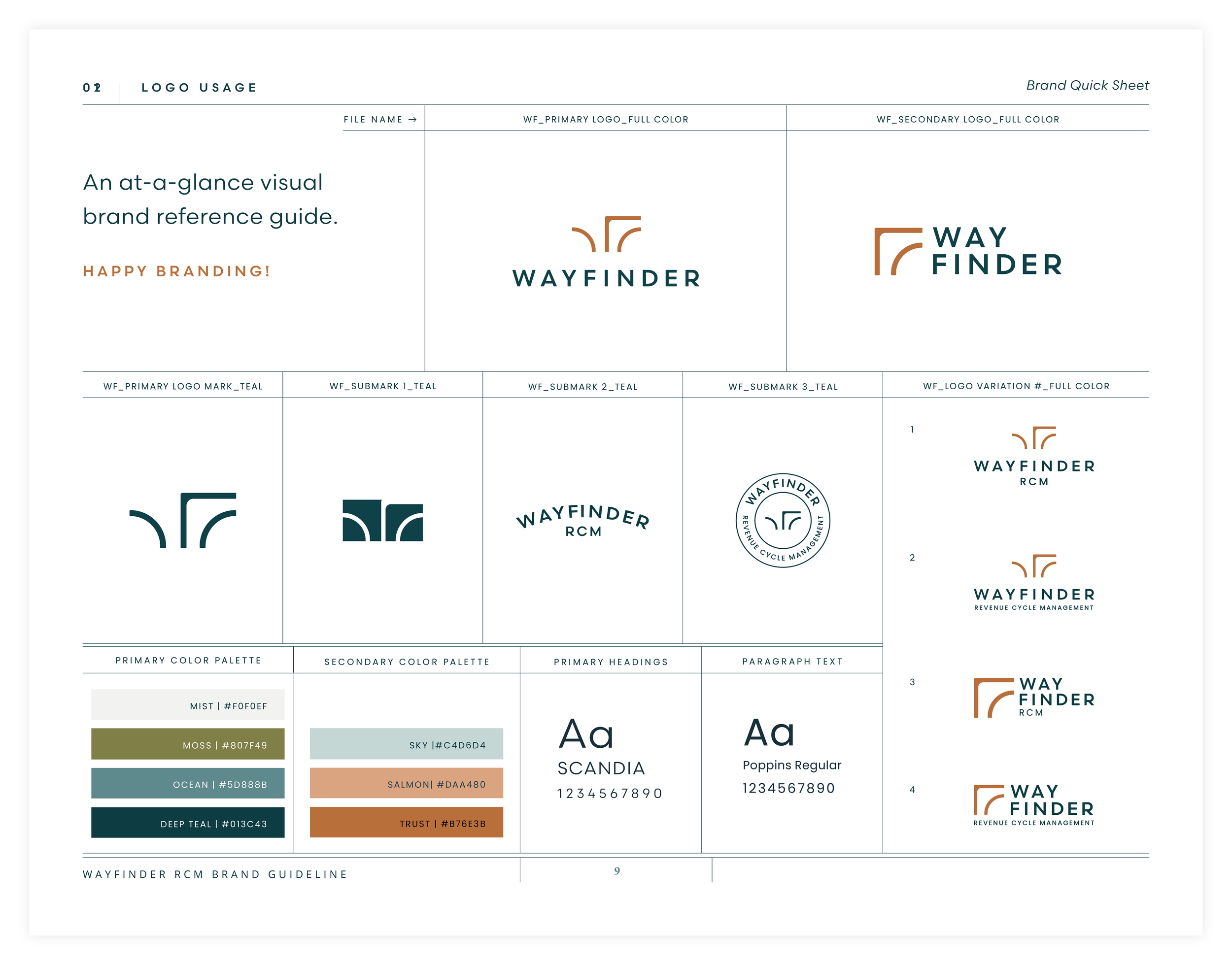
The logo mark is a representation of parallel pathways as well as a directional arrow. The parallel nature of these lines speaks to the process in which Wayfinder collaboratively guides their clients while honoring that everyone’s journey is unique. The arrow to the right indicates a direction forward. This mark also reads as creates a subtle ‘WF’ monogram.


